How to Paint Clouds in Acrylic (Step-by-Step Guide for Soft, Realistic Skies)
Painting clouds can be difficult. There are some key reasons that make clouds hard to paint, and I’m going to discuss how you can focus on those things to create better clouds.
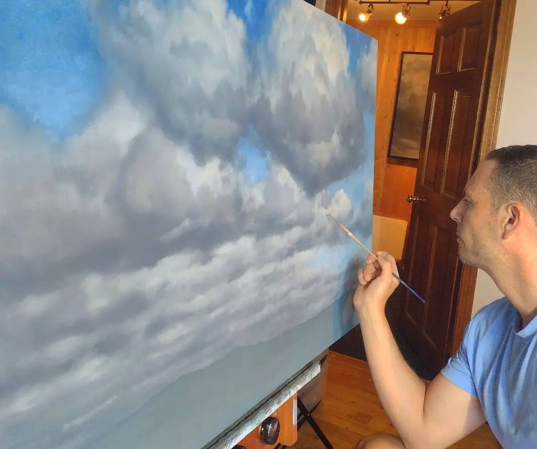
If you’ve ever tried painting clouds in acrylic and ended up with stiff, flat, or unrealistic results, you’re not alone. Acrylic paint dries quickly, which makes blending more challenging—but with the right techniques, you can create soft, glowing, realistic clouds with depth and atmosphere.
Why Painting Clouds in Acrylic Is So Challenging
Before we get into techniques, it helps to understand why clouds are tricky:
-
They have soft, constantly changing edges
-
They rely heavily on subtle value shifts
-
Light behaves in complex ways, including reflected light
-
Acrylic paint dries fast, limiting traditional blending
Once you understand these challenges, you can start using them to your advantage.
1. Soft Edges: The Key to Realistic Clouds
The first thing is, clouds have soft edges. Clouds are always moving and morphing, and the edges are not sharp. When you create sharp edges on your clouds it looks like the clouds are sitting on top of your canvas rather than sitting within your canvas in your sky.
With acrylic paint this can be difficult because painting wet on wet is a short window since the paint dries so fast. So rather than blending you have to learn how to layer and use soft brush strokes along edges to allow the underneath color to show through a bit on the edge to create that softness.
Think about creating your edges with less paint and overlap your sky so the sky shows through just slightly, creating a hazy soft edge.
Techniques to create soft edges in acrylic:
-
Use less paint on your brush
-
Let underlying layers show through
-
Use light, feathered strokes along edges
-
Avoid outlining your cloud shapes
Another way you can do this is scumbling. You just scrub with a dry brush, using a very thin layer of paint along the edges. Scrubbing creates a softer, more natural transition that works especially well for cloud painting.
Soft edges make clouds feel like they are part of the sky, while hard edges make them feel pasted on top.
2. Understanding Lighting in Clouds
The second key thing is lighting. Clouds not only have a light source illuminating them, but they also have redirected light within shadows, and in areas that you don’t think would normally receive light.
This is what separates beginner clouds from more realistic cloud paintings.
What is happening is that light enters the cloud, bounces around within it, and softly illuminates areas that are technically in shadow. Because of this, shadows in clouds are rarely flat or lifeless.
What to look for in reference photos:
-
Subtle light within shadow areas
-
Color variation in shadows (cool and warm shifts)
-
Gradual transitions instead of harsh edges
When painting clouds in acrylic, try to think beyond simple light and dark. Instead, think of light as something that wraps around and moves through the cloud structure.
How to apply this in your painting:
-
Block in shadow shapes first
-
Build mid-tones gradually
-
Add highlights last and sparingly
-
Keep transitions soft
If you go straight to bright highlights too early, you will lose depth.
3. Why Cloud Edges Are Often Darker Than the Highlights
The third thing is, a lot of times the top edge of contours is slightly darker than the highlight of the cloud. A lot of people think highlighting all the way up to the edge is the way to go, but in reality, the brightest highlights are often inside the cloud forms.
This creates a much stronger sense of depth.
The reason this works is that the strongest light hits surfaces that face the light source directly. As the form curves away, even slightly, it begins to lose intensity. On top of that, atmospheric haze can soften and slightly darken the outer edges.
So instead of pushing pure white all the way to the edge, keep your brightest areas slightly inside the cloud and allow the outer edge to be just a bit darker.
This subtle shift creates a convincing three-dimensional effect and makes your clouds feel more natural.
4. Color Mixing for Clouds in Acrylic
One of the biggest mistakes in cloud painting is relying too heavily on pure white.
Clouds are influenced by the sky, the light source, and atmospheric conditions, which means they contain subtle color shifts.
A simple acrylic palette for clouds:
-
Titanium White
-
Ultramarine Blue
-
Burnt Sienna
-
Yellow Ochre
Light areas:
Mix white with a small amount of warmth, such as yellow ochre. This prevents the highlights from looking chalky.
Shadow areas:
Mix ultramarine blue with burnt sienna and adjust with white. This creates natural gray tones that feel more believable.
What to avoid:
-
Pure white everywhere
-
Straight black for shadows
These choices tend to flatten your painting and remove depth.
5. Step-by-Step: How to Paint Clouds in Acrylic
Here is a simple process you can follow:
Step 1:
Paint the sky background first
Step 2:
Block in large cloud shapes using simple forms
Step 3:
Add shadow shapes to establish depth
Step 4:
Build mid-tones to develop form
Step 5:
Add highlights carefully and in the right areas
Step 6:
Soften edges using light strokes or scumbling
6. Common Cloud Painting Mistakes and Fixes
Clouds look flat
Increase the contrast between light and shadow
Clouds look stiff
Soften edges and remove hard outlines
Colors look muddy
Use fewer colors and avoid overmixing
Clouds look too chalky
Reduce reliance on pure white
7. Practice Exercise
A simple way to improve quickly is to remove color entirely.
Try painting clouds using only black, white, and gray. Focus only on value and shape. This will train your eye to see structure and depth more clearly.
Take Your Cloud Painting Further
If you want a deeper, step-by-step walkthrough, you can check out my full cloud painting lesson where I go through the entire process in real time, including color mixing, layering, and creating atmosphere.
You can also use my painting tools to help with color mixing, value checking, and simplifying shapes before you begin.
Final Thoughts
Painting clouds in acrylic becomes much easier when you focus on the right things.
Soft edges, controlled lighting, strong value structure, and thoughtful color mixing will make a noticeable difference in your results. With practice and the right approach, your clouds will start to feel more natural, more dimensional, and more connected to the sky around them.