What is the Art Project?
The Art Project is a collaborative single piece of art that is created by artists from all around the world, with a wide range of painting experience. One incredible painting, created by many artists.
If you’re interested in applying to take part in The Art Project please fill out the form below. You will be sent instructions and some supplies in the mail and must complete the project within two weeks and return your work to Tim Gagnon. This project is somewhat secret in the sense that the end result will be a surprise.
You’ll be painting a very small number of surfaces. The time to complete the project will be around 2 to 4 hours on average. For those who are experienced it may take even less time. It will be simple work, but end up being a pretty incredible experience if my predictions are right :). Join below and you’ll be notified if you’re accepted in a few days.
The information below will be kept private. I need your address so I can send you the supply and instruction packet.
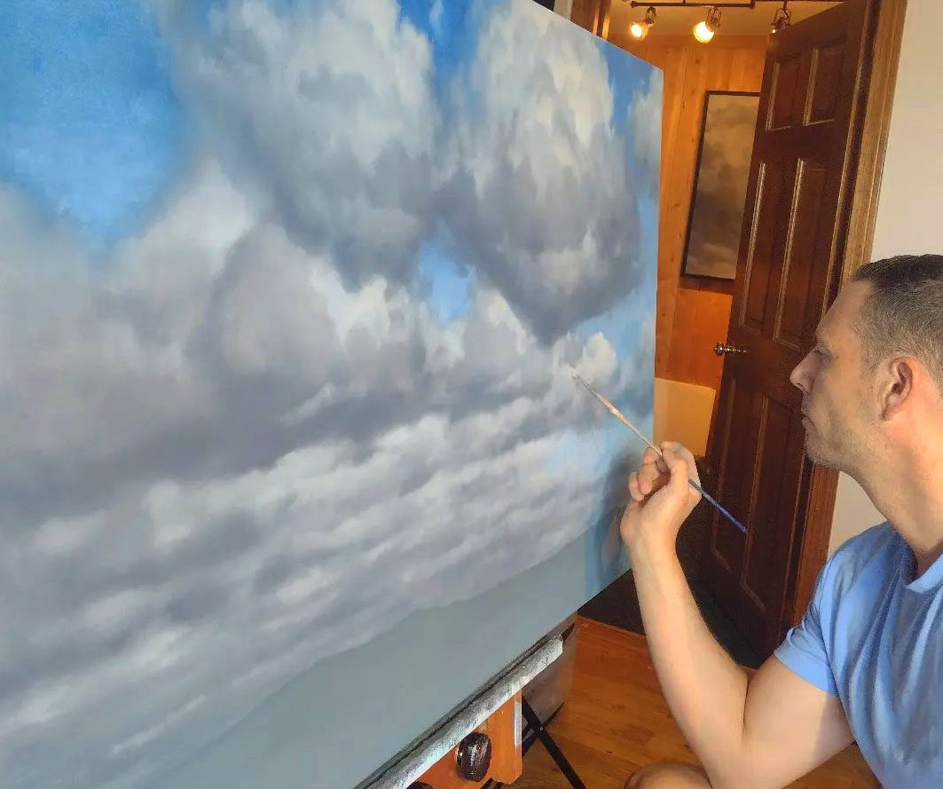
Misty Forest Painting – LIVE ZOOM WORKSHOP from 3.18.23
If you want to gain access to hundreds of painting lessons instantly and also be invited to the over 20 live painting workshops throughout the year, you can join the membership program. The membership program gives you full access to everything on the website on a year to year basis. You can sign up annually, or monthly! Not only can you attend the live workshops, you can also watch them over and over, or at any time if you can’t make the live session. As a member you’ll be able to access the recordings of the live workshops. You’ll instantly unlock hundreds of on-demand painting lessons, you’ll get invited to live critique nights and more!
Enter this password to watch the workshop recording below: 48275
Welcome!
I hope you are feeling inspired to create. As an artist myself, I know how challenging it can be to find the time, energy, and motivation to pursue our passion. But let me tell you, it’s worth it.
As a teacher, my mission is to help you learn and grow as an artist. I want to share with you all that I’ve learned throughout my journey, so you can continue to develop your skills and find your own unique voice as a creator.
Teaching art is not just a job to me – it’s a calling. I love seeing the joy and excitement on your faces as you create something beautiful and meaningful. It’s a privilege to be part of your journey, and I am committed to supporting you every step of the way.
So, let me take this opportunity to express my gratitude for choosing me as your teacher. I truly appreciate your trust and confidence in me, and I will do everything in my power to help you achieve your artistic goals.
Remember, the road to mastery is long and challenging, but it’s also incredibly rewarding. Let’s continue to inspire each other, learn from each other, and create amazing art together.
Thank you for being part of my community, and let’s keep painting!
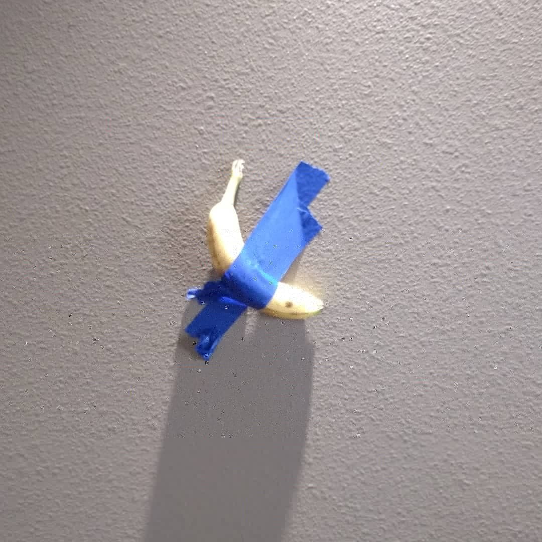
Should we be mad about a banana being taped to a wall selling for $120,000? Maybe.
Maybe there are lessons to be learned here as artists. I heard a lot of people, myself included, saying “Who would be so stupid to spend $120,000 on a banana?” Maybe they aren’t “stupid” at all. Maybe they are genius. Why, how can they be a genius?
Well, the buyer didn’t actually “buy” the banana, they bought the concept, and the certificate of authenticity. Look at the viral nature of what happened with the banana. Who hasn’t heard about it? Is that worth $120,000 in publicity and marketing? For both the artist and the buyer? They can now print that image on t-shirts if they want and make a boatload of money off the viral publicity. Or maybe they want to sell some prints, or maybe they just want to get their name out there to the world. Companies spend way more money than $120,000 to get their name out to millions. They spend millions to reach millions.
So what can we learn from this “gimmick” as artists. And it is a gimmick by the way. A lot of art is about gimmickry.
Lesson 1 – Brand is important. Creating a brand is a large part of what makes an artist successful. Sometimes it’s based on talent, sometimes it’s based on a theme, sometimes personality, sometimes gimmickry, and sometimes it’s just about how attractive you are. The art world can be shallow, but don’t let that bother you if you want to sell your work. Doesn’t really matter what it is, you need a brand.
Lesson 2 – Marketing is powerful. How you market yourself, and what you do to get yourself seen is important. Do you take risks? Are you too conservative? Do you cower at the thought of constant self promotion? If you aren’t hustling with marketing you won’t stay relevant. Why? Social media is why. Our attention span is about 5 minutes long now. If you aren’t in sight, you aren’t in mind. That’s just how it goes. Banana man will be forgotten in a month or so, but if they capitalize on the publicity, they can stay in the limelight for a long time. The banana was the key to the city, now they city has to be managed. You gotta put yourself out there, but you have to do it right. You can’t just flail. Thoughtful marketing is key to becoming a known artist.
Lesson 3 – Talent isn’t always the key to success. Your personality can play a bigger part of how successful you are. If you have a big personality you can play it up, if you are just a kind, generous person you need to show that. People connect with people as well as their art. So there are two parts to the connection you have to think about. How you present yourself will always be just about as important as your art. If you are extremely talented you might not have to worry about it as much. But you can get by with less talent and experience if you can connect with people.
Lesson 4 – There is a lot of money out there for art. Don’t get discouraged if you aren’t selling well yet. You just have to work on the things above. There is plenty of money out there, it’s not running out. $120,000 for a banana proves that. You just have to figure out your brand, your marketing and your connection. Then you can get the ball rolling.
So, we don’t have to be mad about the banana. We just have to accept that the art world is weird, and if we can figure out how to be weird with it we will be successful.
Want more marketing and art world advice? Join my membership program and get online painting/drawing lessons, marketing help and more! CLICK HERE FOR MORE INFORMATION!
Color selection can be daunting, so when I sit down to paint something I try to figure out how I can make it as simple as possible. Even when painting from a photo or other reference you don’t necessarily have to try and copy the photo. Sometimes you can look at the photo to get an idea and then select your own colors and use the reference for shape, value and structure.
Before I digress too much I’m going to jump right into the colors I used for this painting so I don’t bore you all.
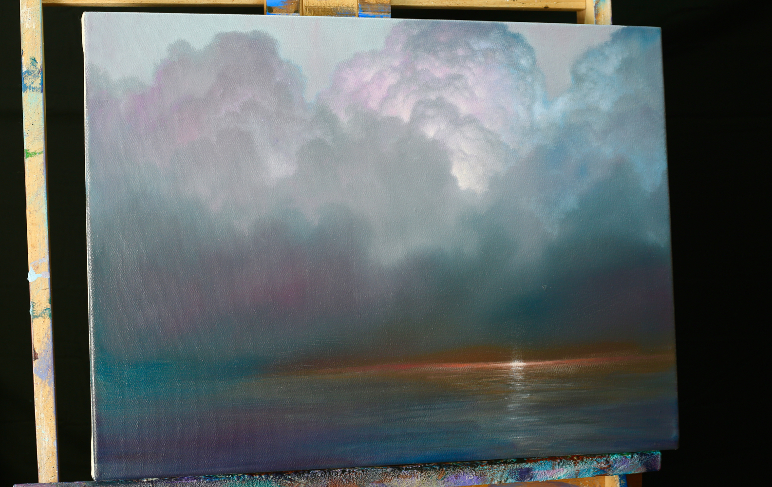
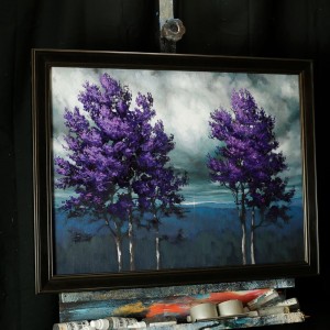
What I wanted to do with this painting is keep it ethereal (hence the title Ethereal Passing). I wanted the colors to be colorful and vibrant yet subtle. I decided I wanted to do something in an analogous color scheme. Analogous color schemes are taking colors that are side by side on the color wheel. But think a real big color wheel with lots of shades, not the simple one you’re used to seeing. So for this painting I wanted something that went from Crimson/Pink to Purple, to Blue. So when you look at the clouds I used Alizarin for the pink, amethyst for the purple, and prussian blue and titanium for the blue. I slowly shifted the colors together to create the bold colorful look in the highlighted/detailed portion of the cloud.
I find that analogous schemes work so well in paintings. They just always seem to look good and smooth, and that’s because the colors are all side by side on the color wheel, so the harmony is very natural.
Another thing I like to do within my analogous color schemes is compliment some of the colors. So I created the orange glow beneath the clouds with cadmium orange. This compliments the blues in the clouds. I didn’t want it to be super bold though, because cadmium out of the tube is vibrant. I added titanium white to it to reduce the saturation and keep it within that ethereal feel. I then incorporated little tiny bits of that in the clouds, because when you add more and more white to cadmium orange it actually pushes it toward the yellow scale.
So by making it a little more yellowish it compliments the amethyst and alizarin. It’s a close compliment rather than a direct compliment.
The really big key in this painting is all the grays. How do you make the right gray to fit the painting? I used prussian blue mixed with orange. Compliments mixed together tend to create gray or brown, and if you keep the mixture a little leaning more toward blue you get more gray. That was the main mixture for grays, but I’d add little bits of alizarin and amethyst to that gray here and there to create more harmony throughout the colors.
So to recap, I created an analogous scheme with alizarin, amethyst and prussian blue. Then I complimented the entire thing with tiny bits of cadmium orange and cadmium orange mixed with titanium white (to make it lean toward ethereal white/yellow).
Make sure you join my newsletter so you don’t miss out on any other future color mixing blogs, and be sure to check out my latest online painting lessons!
Join me in Maumee, Ohio as I do a free painting demonstration and have a display of my work at American Frame Showroom. November 3rd starting at 3PM.
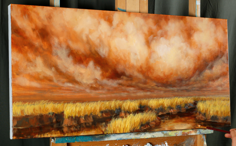
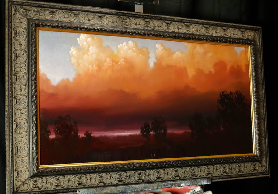
I’ve been getting ready to display some of my work at the American Frame gallery in a few weeks. I’ve been going back and forth between some of my older work and some of my new stuff, debating on what to send them.
I’m also trying to bang out a big painting a day. Over the past two days I’ve done two really large cloudscapes. The one you see here took me about 90 minutes to complete from start to finish. It’s a 30 X 48 inch canvas. This is probably my favorite painting I’m sending for the show.
One thing that I’ve seen over years of doing workshops is that we have a tendency to over-paint. In the workshop setting that is easy to do because everyone paints at a different pace and you don’t want to just sit there and not paint. So in that setting it’s different. Plus I’m there to tell you to stop it! 🙂
In your home setting it’s hard to tell when a painting is done. What I used to tell people is that “it’s done when you feel happy looking at it.” But after thinking about this I’m going to give you all a more technical answer.
The painting is done when you’ve created a variety of values, subtle color variations, good contrast, and mood. So what I suggest, is asking yourself these questions every hour or so while you paint. Because it might be “done” before you thought it was.
1. How many values do I see in this painting? Do I cover a good range or am I stuck in midtone value purgatory? If you have a good value range you may be closer to done than you thought. It might be a matter of refinement than adding new paint layers.
2. Do I have good contrast? Contrast creates depth, light, shadow, and 3 dimension. This kind of goes along with values, but contrast can also be created with color (warm/cool combos etc). A shot of reddish or purplish can make green pop and vice versa. Sometimes adding in subtle compliments can really spruce up your contrast. Don’t miss out on this week’s special priced lessons! 50% off these two great painting lessons. Click the images to go to the lesson page.
Cloudy Days and Waterways – Oil painting lesson
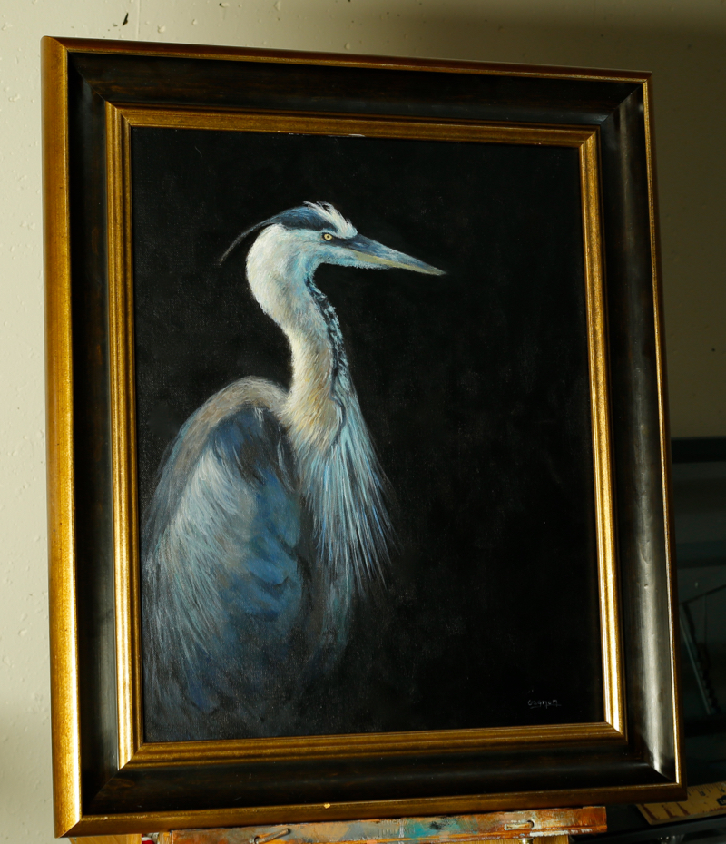
Blue Heron – Acrylic Painting Lesson
3. Does my painting have big voids? Empty space can be powerful, or it can be distracting. Balance in a painting doesn’t mean symmetry. Big open spaces, elements all on the same plane, lack of angles can hurt your composition. If you leave empty space, make sure it is to aid in the composition of the painting (I’ll talk about this more on another day.)
4. What is “fill in blank” missing? Does your tree need highlights? Shadow? Does your apple have reflected light? Take a look at the important elements and ask what’s missing. If you can’t think of anything it’s probably done.
If you don’t stop to analyze your painting every so often then you may have missed the point at which it was done, and you end up over-painting it.
I like going to art museums so I can look at paintings really close up. I like to see all the brush strokes. I want to see how much effort was put into a highlight or a shadow, or a transitional color that connects the two. Usually I’m surprised by what I see.
Have you ever painted and thought, “I don’t really like this.” Then you leave the room and come back and when you see it you think, “actually that looks pretty good.” This happens because we are painting the canvas at a distance that is closer than viewing distance.
When you go to museums you can quickly tell who the artists are. They are the ones getting yelled at by security to “Please step back from the painting!” Artists like to see how brush strokes were put together, but the average viewer stands 6 to 8 feet away from the painting when looking at it.
What happens when we step back from the painting? Well, our brushstrokes melt together, we don’t see the canvas ‘bumps’, we see the painting as a whole, and we can see the overall contrast much better. If you’ve taken some of my online painting lessons you’ll hear me roll back in my chair pretty often. The reason I do this is so I can get to viewing distance and see the painting as a whole. That helps me determine how much more effort I need to put in to render an object.
After doing workshops for the past 4 years I’ve noticed that a lot of people don’t get up and step back enough. If you are too close to your painting all the time you start to overthink the brushstrokes because you are thinking too much in great detail. Details appear more clearly at a distance. That’s why Sargent was able to create masterful works with just quick single brush strokes.
If you focus more on value, color and proportion your paintings will be great, no matter the brushstrokes. There’s a reason why impressionist paintings are so popular. The further you step back from them, the more real they appear (with masterful colors and movement).
So try to stop overthinking your brushstrokes and be free. Take your time when you paint, but don’t dwell. Dwelling is the land of over painting. Step back and observe your colors and values. The way you apply the paint is your own style. It’s great to know how to approach brush strokes, but to try to paint every single detail with a tiny brush can just make your painting look plain.
Get a chair that rolls, and start rolling back and loving your paintings! 🙂
CHECK OUT MY LATEST TWO ONLINE PAINTING LESSONS BELOW!
The Bend Between Trees – Acrylic painting lesson. Click the image above for more info!
Edge of Calm Waters – Acrylic painting lesson. Click the image above for more info!
What did we find? Well, we found that a couple combinations will work great for creating a deep blue sky. But our closest match was Ultramarine Blue and Raw Umber and White. Tune in next week for another episode of What’s That Color, where I’ll tackle the color of something in the world!
Don’t forget about my special offers! Get the Basic Landscape Fundamentals Set for only $129 right now with coupon code: BLF129
CLICK HERE TO TAKE ADVANTAGE OF THIS OFFER BEFORE JUNE 10th
Get my popular Misty Forest Series Set for only $49
CLICK HERE TO TAKE ADVANTAGE OF THIS OFFERE BEFORE JUNE 10TH
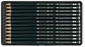
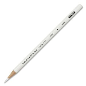
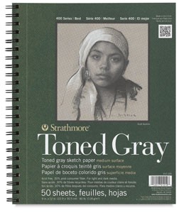
The best way to learn values, I’ve found, is by using a toned sketchbook. It’s great because it starts you out in a midtone value that you can either increase or tone down. This gives you great flexibility and will help you immensely with painting.
Values are one of the most important things in painting. Value creates light, contrast and focal points. If you’ve ever looked at some of the Hudson River School of art guys from the 1800s like Bierstadt and Innes you’ll see that they were masters of value. Using light clouds in behind dark clouds to create visual interest points, or great variations of value on mountains in the distance and foreground to create depth.
So how do you create value with a toned sketchbook?
Using both dark leads and a white pencil I create different values. Starting with HB and B pencils I start a sketch. These leads are hard and create lighter lines. I then start to add some of the light values with the white pencil. The reason I do this is because the white pencil doesn’t go over dark lead very well. So in order to prevent smudging I put in lights first. I only work in some lights, not all, and put them in faintly.
Then I start going with darker, softer lead like a 4b pencil. I start putting in some semi-dark values. Once I have some semi dark values in I switch back and add in semi light values with the white pencil.
I use this process of back and forth to slowly work up values. By doing this you can look at your reference photo or subject and compare and see where all the slight variations are.
Eventually I go to my 8b pencil and put in really dark values. Then the last step is putting in the brightest whites (values) with my white pencil.
Doing this process will help you with your paintings. Why?
Because a lot of times its hard to tell what colors have brighter values in your subject. For example a red might be really bright but be darker in value than a blue that is in the distance. By breaking down your image into black and white values you’ll start to understand and see all of those slight variations. This will help you create effective light and detail in your paintings.
So get a little sketchy and start sketching!
Thanks for reading my quick tips and tricks for this week! In the meantime I’ve included pictures of the supplies I use for my value sketches below. I also have two great painting lesson offers below as well!
I always get a great painting idea when I’m not expecting it. I’ll be driving down the road, daydreaming, and all of a sudden I’ll see a cloud, a tree, a road and think of this great idea for a painting. It’s kind of like waking up in the middle of the night with that great business idea. The one that gets you excited, but then you go back to sleep and in the morning you say to yourself “I’ll start working on that tomorrow..” Then that idea never happens, because it’s always, “I’ll work on that tomorrow,” and that tomorrow never ends up coming.
It can be the same with painting, and I’m guilty of it too. Sometimes those great ideas are hard to tackle because they are in your head. I think that is the main reason why its so hard to start. Images in your mind aren’t always easy to reference. It’s not like looking at a photo and trying to copy shapes and colors. Ideas are much more abstract, and hard to define in imagery. That is why I love it. Interpretation of your imagination results in dreamy, surreal paintings. I think the hard part is just knowing where to start.
I figured I’d write a short blog on how I tackle an idea when I have one. Maybe it’ll help you put some of your imagination on canvas too!
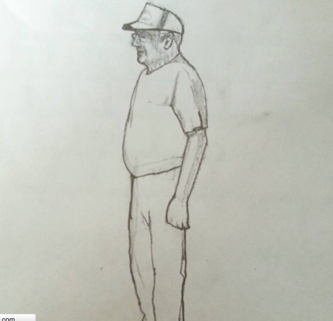
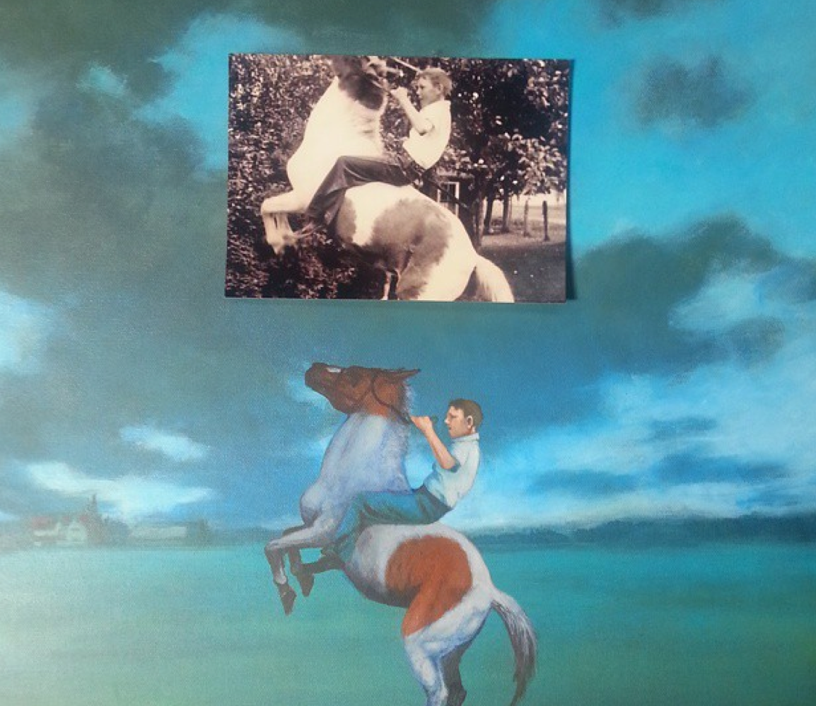
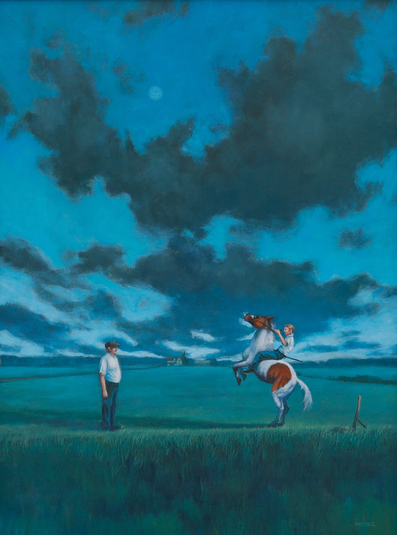
About a year ago I had this idea for a painting. I wanted to do a painting of my grandfather looking back at himself as a kid. I wanted it to be literal, but at the same time a mystery. I thought about it a long time, and I just couldn’t get the concept right in my head. So I did what I always do when I can’t quite figure out how I’m going to put my idea on canvas. I get out the sketchbook.
I found a picture of my grandfather with a side profile and I did a little sketch of it. Doing the sketch gave me my main character for my painting, and at the same time energized my mind. Once I had something down on paper I started thinking of other ideas I could add to it. So I’d flip to a new page and draw out some other ideas and a variety of characters.
When you sketch out your idea on paper you can make a bunch of mistakes without feeling too bad about it. A quick sketch get’s you warmed up as well as gives you a foundation on which to do your painting. Another reason sketching out your idea is great, is you can do multiple compositions and then decide which one is more true to your imagination. Connecting your subconscious mind to your conscious mind takes practice when it comes to drawing and painting. The more you practice putting your idea on paper the better you’ll get at putting your ideas on canvas.
Once I have all the elements of the painting sketched out, I then do a really rough sketch of my composition. How tall I want to make the characters, how much sky, how much land. Just some basic lines here and there. That gets me started with my painting.
Next, I use a variety of reference photos. I need to have some sort of reference for shape. Clouds and trees are easy for me to do from my imagination. People and animals are not. So I use reference photos to give myself some ideas, and some information that I can use so I can get believable shapes. I usually use my own colors and try not to worry about matching colors from a photo. Reference photos will help you bridge the gaps where you can’t think of how something looks.
I try to find photos that fit my ideas specifically. By that I mean, if I have a certain stance or certain shape I really want, I’ll search high and low for a reference photo that gives me something to go by. If I can’t find one in my photos or online, I’ll just do the pose myself, or find a tree in the yard that looks like something I want to do.
Once I have a composition, and all my shapes on the canvas I put everything away. No more sketchbooks, no more reference photos, no more reference material. This is where I really take the painting from an idea to a real painting. This is where I really lock into my imagination, my idea. I allow myself to make some mistakes, or to make things up because I want it to look dreamy. I don’t want everything to be completely accurate like a photo. I want it to have that feeling that its mysterious and came from my mind.
If I were to keep referencing photos, sketches or other material I would feel too constrained. I think that would then show in the painting. As artists we should force ourselves to trust our instincts, and trust our imagination. Trusting yourself to take all of those sketches and ideas to a completed painting is vital. Trust your first instincts when making painting decisions. Don’t second guess your composition. Stick to it all the way through. There are going to be times where your painting doesn’t look right. It is part of the process. Small adjustments are okay, but don’t give up halfway through. I always hit that point of “oh boy… this painting is crap,” but I get through it and everything starts to take shape. You have to get through the highs and lows when painting from your mind.
I like to throw on some music and lose myself in the painting. I’m not thinking about technicalities anymore, about color combinations, about art theory… I’m thinking about why I’m painting this image. That will take you to the finish, and then you can look at your imagination straight in the face.. on canvas.
Check out my mini documentary about this painting below!! Thanks for reading and watching!
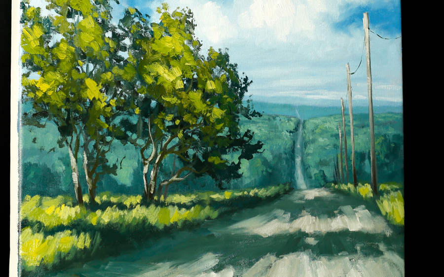
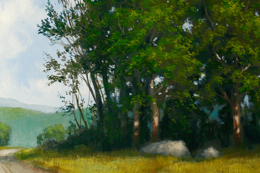
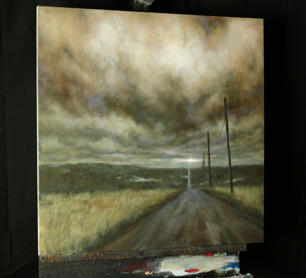
Have you ever heard someone say that in a city, or in a town that resembles the movie set of ‘Deliverance?” Think about the history that road must have racked up to deserve that notorious statement. It’s a road that will take you places you don’t want to go, because if you do go down that road, you just might hear faint dueling banjos, and you know that can’t be good.
Roads are fascinating to me, especially lately. Whenever I drive around I think about the road I’m on. How they become familiar and become, in a way, home. Whenever we are returning from taking our dogs on a ride, they all perk up when we turn onto the road to our house. Their ears go forward, they start looking back and forth out the windows, they whine a little bit and have this bouncy, slightly annoying, energy, because they know this is the way to their territory.
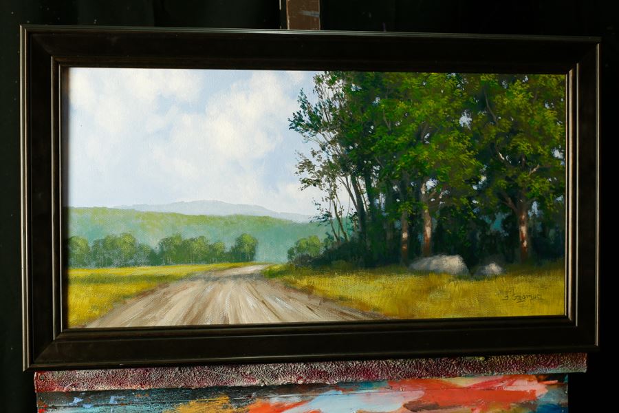
Press Down Road – Click the image to learn how to paint this painting!
I think I’ve mentioned before that I live in the middle of nowhere in Northern Maine. Well, we have to drive about 50 miles to get to the nearest interstate. Most of the times when we go on trips we are driving long distances. After a long trip, driving hours and hours, it’s alway a great feeling to get on that last stretch of road that brings us home.
In order to go to that wedding, funeral, first date, basketball game, family get together, we have to take roads. They hold an amazing significance that maybe we don’t always recognize. Old tar roads, dirt roads, highways, they all have their landmarks that we recognize, an old tree, a dilapidated building, and things that give us that nostalgic feeling. We go for drives on roads to unwind, de-stress, to think, listen to music, try out that new car, or just because we are bored and we want to cruise around with the windows down.
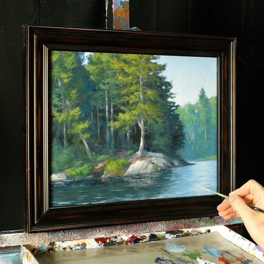
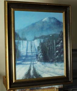
The Road Home – Click the image to learn how to paint this painting!
This is why I’ve found a new fascination with painting roads. The final destination is a mystery in each painting, but it always holds significance to the person traveling that road.
Symbolism is so important in paintings, especially landscapse (IMHO). It helps you get a theme or story across without being too literal. Symbolism gives your painting something to think about. Landscapes are mysterious in their own right, but sometimes people might look at them and move on without much thought. By adding in something for them to ponder over makes your painting stronger, and more fun to view.
A road in a painting makes you travel into it and live there for a moment. Sometimes that’s just what we need in a landscape. An escape is easier if you have a road.