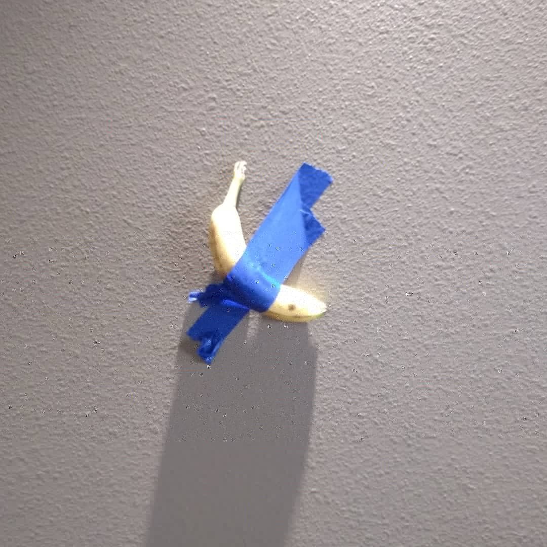
Should we be mad about a banana being taped to a wall selling for $120,000? Maybe.
Maybe there are lessons to be learned here as artists. I heard a lot of people, myself included, saying “Who would be so stupid to spend $120,000 on a banana?” Maybe they aren’t “stupid” at all. Maybe they are genius. Why, how can they be a genius?
Well, the buyer didn’t actually “buy” the banana, they bought the concept, and the certificate of authenticity. Look at the viral nature of what happened with the banana. Who hasn’t heard about it? Is that worth $120,000 in publicity and marketing? For both the artist and the buyer? They can now print that image on t-shirts if they want and make a boatload of money off the viral publicity. Or maybe they want to sell some prints, or maybe they just want to get their name out there to the world. Companies spend way more money than $120,000 to get their name out to millions. They spend millions to reach millions.
So what can we learn from this “gimmick” as artists. And it is a gimmick by the way. A lot of art is about gimmickry.
Lesson 1 – Brand is important. Creating a brand is a large part of what makes an artist successful. Sometimes it’s based on talent, sometimes it’s based on a theme, sometimes personality, sometimes gimmickry, and sometimes it’s just about how attractive you are. The art world can be shallow, but don’t let that bother you if you want to sell your work. Doesn’t really matter what it is, you need a brand.
Lesson 2 – Marketing is powerful. How you market yourself, and what you do to get yourself seen is important. Do you take risks? Are you too conservative? Do you cower at the thought of constant self promotion? If you aren’t hustling with marketing you won’t stay relevant. Why? Social media is why. Our attention span is about 5 minutes long now. If you aren’t in sight, you aren’t in mind. That’s just how it goes. Banana man will be forgotten in a month or so, but if they capitalize on the publicity, they can stay in the limelight for a long time. The banana was the key to the city, now they city has to be managed. You gotta put yourself out there, but you have to do it right. You can’t just flail. Thoughtful marketing is key to becoming a known artist.
Lesson 3 – Talent isn’t always the key to success. Your personality can play a bigger part of how successful you are. If you have a big personality you can play it up, if you are just a kind, generous person you need to show that. People connect with people as well as their art. So there are two parts to the connection you have to think about. How you present yourself will always be just about as important as your art. If you are extremely talented you might not have to worry about it as much. But you can get by with less talent and experience if you can connect with people.
Lesson 4 – There is a lot of money out there for art. Don’t get discouraged if you aren’t selling well yet. You just have to work on the things above. There is plenty of money out there, it’s not running out. $120,000 for a banana proves that. You just have to figure out your brand, your marketing and your connection. Then you can get the ball rolling.
So, we don’t have to be mad about the banana. We just have to accept that the art world is weird, and if we can figure out how to be weird with it we will be successful.
Want more marketing and art world advice? Join my membership program and get online painting/drawing lessons, marketing help and more! CLICK HERE FOR MORE INFORMATION!